
New: Downstream Service Monitoring
Product
Having detailed response time percentiles and impact analysis for transactions is great. But often it’s not the php application that is causing unwanted spikes in response times rather than services used by your application, such as MySQL, redis, HTTP APIs and so on.
As of now, you can see problems with these ‘downstream services’ at a quick glance:
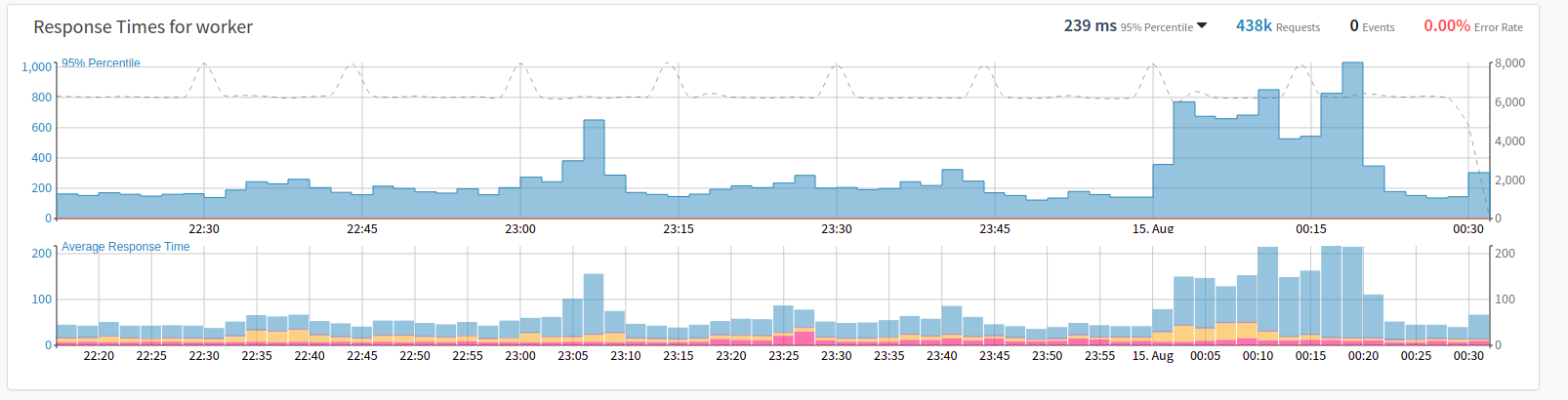
Downstream services include the following layers so far:
- SQL (PDO, ext/mysql, ext/mysqli, db2, oci8)
- Memcache
- Redis
- MongoDB
- File I/O (all local file operations)
- Queue (beanstalk, amqp)
- HTTP (all HTTP communication: includes external APIs, elasticsearch, …)
It’s worth noting that downstream services is taking all requests into account, not only those with sampled traces. This was made possible by our new and completely rewritten php extension (version 5.x).
How do I get Downstream Services?
Just update tideways-php and tideways-daemon to the newest versions and the data will be collected automatically. No separate configuration is needed. Until September you need to update your Apt or Yum repository endpoint to our new location to get version 5.
New Tooltip Information
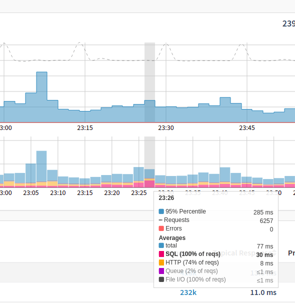
Downstream service layers are integrated in a second graph on your application’s main performance view, showing average response times and what percentages are allocated by the different services. All relevant information was added to the existing tooltip: you can see percentiles and average response time, as well as the number of errors occurred and all downstream service timings. If a single service makes up more than 30% of the total response time, it is specially highlighted (e.g. SQL in the screenshot above).
Average vs. Percentile Response Times
Percentiles are really good for spotting negative outliers in your requests, but you cannot stack percentiles correctly: e.g. 95% percentile for SQL + 95% percentile HTTP might be larger than the 95% percentile of the overall response time. That’s why we display downstream services in a separate graph, using average response times. As a bonus, you can now compare percentiles with average response times side by side.
What’s next?
We have already more ideas, what to do with downstream service data.
Downstream services data can be displayed per transaction when you upgrade to the “Pro” plan, giving you even more insight since service usage within one transaction is usually quite consistent and spikes in a single service most likely indicate problems with that service.
To get a better feeling for long time performance trends we plan to incorporate downstream service data in daily/weekly/monthly history views, as well as the weekly reports. We are also evaluating the possibility to use downstream service data for additional alerting options.
Also, we are testing the idea of specialized views per downstream service layer, to give you a completely new perspective on your performance data, e.g. analyzing SQL performance in detail.
These new features will be added within late 2018 / early 2019, we will keep you posted!
About the author

I’m a Software Engineer at Tideways, where I build and refine features that help developers understand and optimize the performance of their PHP applications. Alongside implementing new functionality, I also enjoy shaping how features are presented, from interface design and visual details to naming, making them intuitive and easy to use.
I enjoy solving technical challenges while creating tools that feel thoughtful and approachable. My work combines software engineering with an eye for usability and developer experience, helping turn complex performance data into features developers can quickly understand and benefit from.